About Us
Explaining the Logo
The story and meaning behind the visual identity of The Gospel Network.
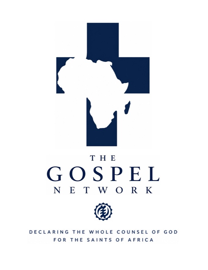
Elements explained
A visual confession.
The Latin Cross
The Latin cross stands at the centre of the identity because the crucified and risen Christ stands at the centre of TGN’s work. Its plain, unornamented form directs attention away from novelty and toward the historic substance of the Christian faith. Tertullian, Cyprian, Lactantius, and Augustine—together with the witness of the African martyrs—demonstrate that the cross was confessed, expounded, and borne within Latin North African Christianity centuries before the modern missionary era. It therefore represents both the universality of the gospel and Africa’s ancient participation in the Christian faith.
The African Continent
Africa appears within the cross rather than merely beside it. The continent is therefore viewed in relation to Christ and His redeeming work. This expresses our desire not simply to distribute Christian information across Africa, but to see people, households, and churches throughout the whole continent brought under the authority of Christ’s Word and increasingly conformed to His image. Africa is prominent, but the cross gives the composition its form: Christ remains the centre, foundation, and goal of the ministry.
The Gye Nyame Heritage Mark
The Gye Nyame symbol honours the Ghanaian roots from which TGN emerged. Its name means “Except for God,” and it traditionally signifies the supremacy and omnipotence of God. Within the TGN identity, it serves as a heritage and publisher’s mark—a reminder that the ministry’s widening continental vision does not require it to forget where the work began. It also confesses that the platform, its writers, and its future exist beneath the sovereign rule of God.
Gye Nyame
Except for God
The Colour Palette
TGN navy (#0D2240) communicates seriousness, stability, confidence, and permanence. White (#FFFFFF) provides clarity, restraint, and openness. Together, the two colours establish a simple and reproducible identity suitable for both digital and printed publication. Their strong contrast also reinforces the relationship between the cross and Africa, allowing each form to remain immediately visible without unnecessary ornament.
The Wordmark
The classical serif wordmark gives The Gospel Network the character of an enduring theological publisher rather than a temporary online project. GOSPEL receives the greatest visual prominence because the gospel is the defining message and controlling centre of the platform. NETWORK occupies a supporting position, representing the fellowship of writers, editors, pastors, churches, and readers who labour together in service of that gospel. The restrained spacing communicates dignity, care, and editorial seriousness.
The Mission Statement
“Declaring the Whole Counsel of God for the Saints of Africa” gives verbal expression to the burden represented by the logo. Drawn from Acts 20:26–27, it commits TGN to the breadth of God’s revealed truth rather than to fashionable subjects, narrow doctrinal interests, or merely reactionary commentary. It also identifies the pastoral purpose and intended audience of the work: to instruct, strengthen, protect, and encourage the saints throughout Africa.